
How to Design a Wedding Invitation That Feels Like You
Design a distinctive wedding invitation with a clear visual idea, readable typography, a confident color palette and a mobile-friendly layout.
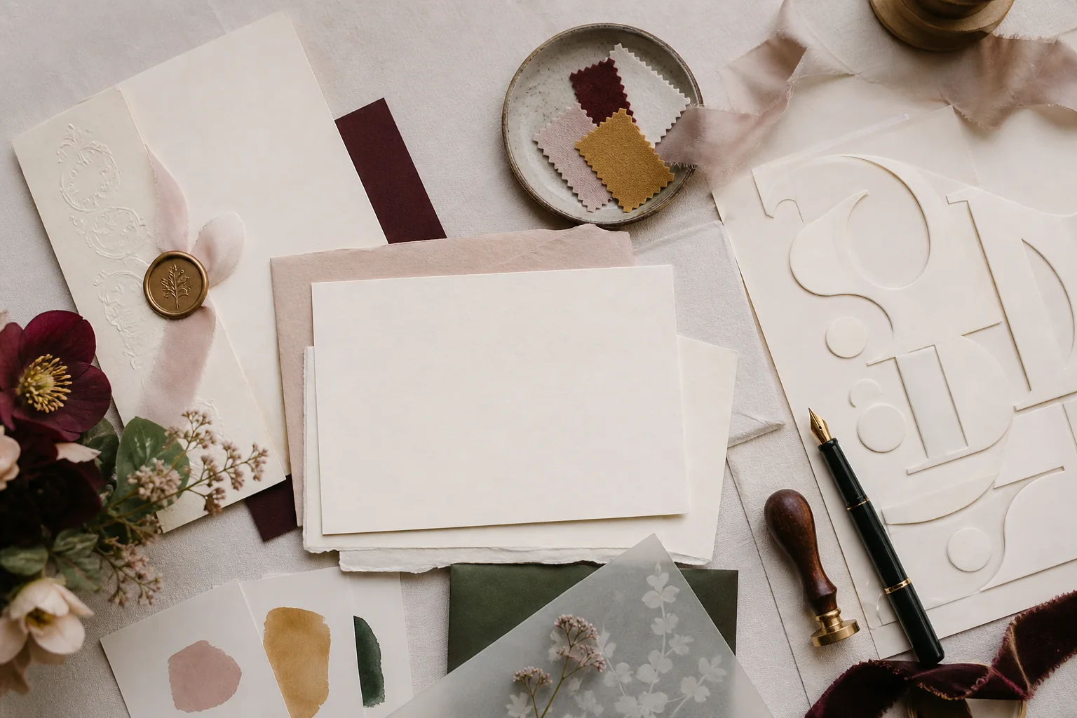
A personal wedding invitation is not the one with the most motifs, the fanciest script or the longest animation. It is the one whose choices seem to belong together. The color feels connected to the celebration. The typography matches the voice. The photographs reveal something true, and the practical details remain effortless to read.
Good design is an editing practice. You begin with many references, then choose one central idea strong enough to guide the rest. This article takes you through that process from mood and hierarchy to mobile testing, so the finished invitation feels specific without becoming visually exhausting.
Begin with one sentence, not a mood board
Before collecting colors and fonts, describe the invitation in one sentence: 'a moonlit garden with quiet Mughal details,' 'a joyful Punjabi celebration built around phulkari color,' or 'a modern coastal weekend with hand-painted maps.' The sentence gives you a filter. A beautiful reference that does not support it can stay beautiful somewhere else.
Look for material from your real celebration: the venue architecture, flowers, clothing, landscape, family craft or a shared memory. Personal does not have to mean literal portraits. A small pattern or color with meaning can carry more identity than a collage of generic wedding symbols.
Create hierarchy before decoration
List what a guest must notice first: usually the couple's names, the fact of the wedding and the date. Event time, venue and RSVP come next. Travel notes, stories and galleries sit deeper. Design the page in that order before adding flourishes. Hierarchy is the invisible hospitality of an invitation.
Use size, spacing, contrast and position to signal importance. Do not make every heading ornate and every card visually loud. When one element leads, the others can be quieter; the page feels more luxurious because it gives the eye somewhere to rest.
- First glance: names and date
- Next action: view events or RSVP
- Event card: event, arrival time, venue
- Supporting layer: dress, travel, story and gallery
Use typography to create voice—and body type to create trust
Choose one expressive typeface for names or short headings and one highly readable face for schedules, buttons and paragraphs. Script type can feel romantic, calligraphic or ceremonial, but it loses its power when used for every sentence. Restriction makes the special moments feel special.
Test every required language and name before committing. A font that looks lovely in an English sample may lack Devanagari, Urdu, Gurmukhi or other characters. Use genuine script support and let each writing system occupy the space it needs instead of forcing identical line lengths.
Build a palette with roles, not just swatches
A useful palette assigns jobs: a light background, a dark text color, a primary accent and one or two supporting tones. This keeps every section from inventing its own color logic. If the wedding wardrobe or décor is not final, choose a palette rooted in the desired atmosphere rather than trying to match uncertain fabric samples exactly.
Check contrast in ordinary conditions. Pale rose text may look delicate on a bright studio monitor and nearly disappear on a phone outdoors. Reserve subtle tones for large decorative areas; keep essential copy and controls strong.
Take a screenshot, convert it to grayscale and glance at it. If headings, body copy and buttons collapse into the same tone, your hierarchy needs more contrast.
Design for the phone in a guest's hand
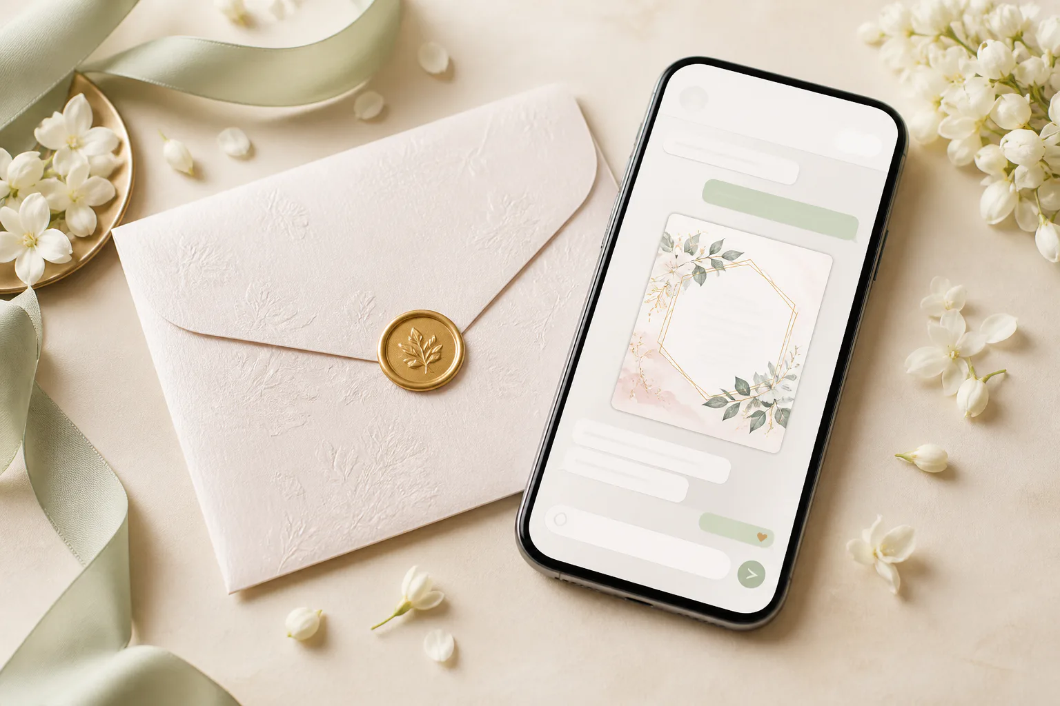
Most digital invitations are opened from a message. That means a narrow screen, one thumb, unpredictable brightness and sometimes limited data. Keep lines comfortable, buttons large and event details in a repeatable order. Avoid placing essential words inside images, where they cannot resize, translate or support a screen reader.
Animation should create an arrival, not a delay. Let guests skip an intro, pause audio and move directly to the schedule. Compress images carefully and test on a modest phone as well as a flagship device. A design is not complete when it looks good in the editor; it is complete when it stays clear in the guest's context.
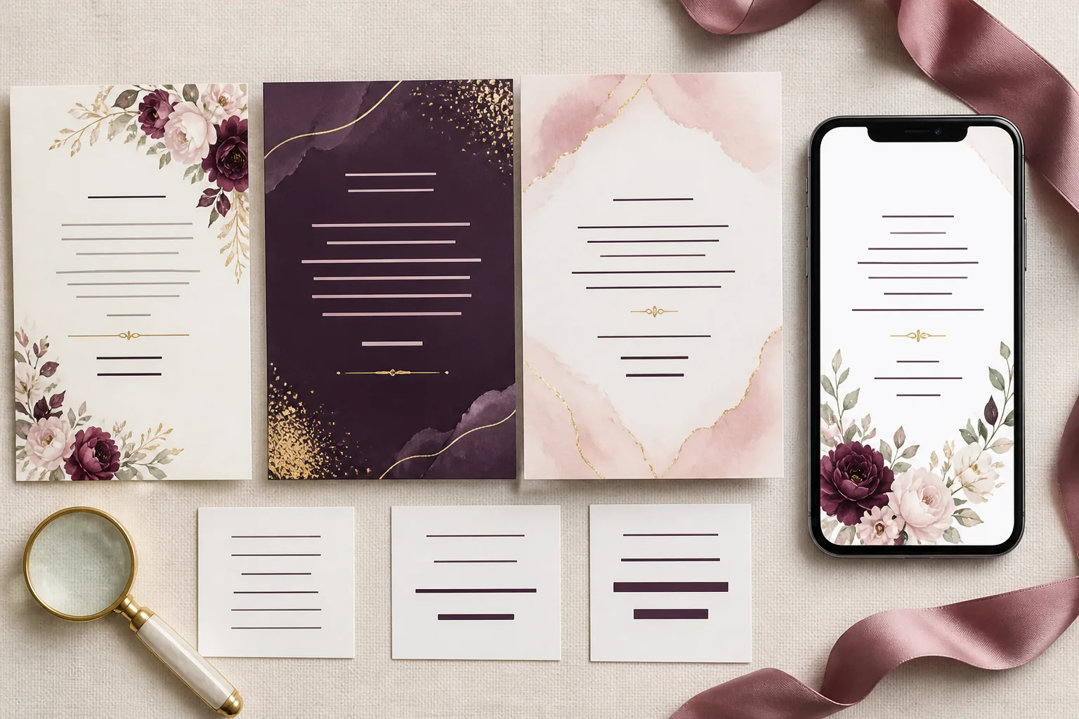
Let images and motion earn their place
Select photographs for emotional range rather than quantity: one portrait, one candid moment, one place and perhaps one family memory. Repeating near-identical poses makes the page longer without deepening the story. Crop with care so faces are not covered by interface elements on smaller screens.
Use movement to reinforce the concept—a curtain opening, petals drifting, light changing—not to animate every object independently. Provide a still experience for reduced-motion preferences. Restraint helps the invitation feel cinematic rather than busy.
Proof the system, not just the first screen
Review every event card, button state, language version and RSVP path. A polished hero cannot compensate for a broken map or a low-contrast dietary field. Create sample data with long venue names and long guest names so the layout proves it can adapt.
Finally, show the invitation to three kinds of reader: someone emotionally close, someone practical and someone unfamiliar with the plan. Ask what it feels like, when the ceremony begins and how they would reply. The best design passes all three questions.
Frequently asked questions
How many fonts should a wedding invitation use?+
Two is a reliable starting point: one expressive display face and one readable text face. A third may support another script or special role, but each addition should have a clear purpose.
How do we choose wedding invitation colors?+
Start from the atmosphere, place, clothing or a meaningful visual reference. Assign each color a role and maintain strong contrast for essential text and buttons.
Should a digital invitation match the wedding décor exactly?+
No. It should feel related, not mechanically identical. A shared palette, material or motif is enough to create continuity.
Put the guide into practice
Create your wedding invitation
Start with a polished template, add every event and share one mobile-friendly link with your guests.
Explore templates